

If your website doesn’t have a traffic problem, then it’s a conversion problem. Service page copywriting often gets overlooked for homepage copy, and that’s not good.
Because every single service you offer should have a dedicated page to move potential clients through the decision making process and encourage them to stay on your website.
I’ve worked on pages that convert at around 65% from cold SEO traffic. People search, they land, and they become clients.
The best news? Once you implement this system your service pages will:
- Become immediately clear
- Show the problem instead of telling it.
- Stop talking about “what’s included” and capture leads by demonstrating why it matters.
- Turn visitors into actual enquiries and paying clients.
- Turn interest into actual enquiries
So, with that in mind, let’s get straight into it.
Service Page Copywriting: Do This First (10-Minute Fix)
Before you read anything else, fix these 3 things on your service page:
- Your headline → make the service obvious
- Your opening → name the real problem
- Your CTA → make the next step feel easy
(You’ll find examples and templates on the next page.) Once you complete the service toolkit, you can dive deeper into SEO and meta descriptions.
The Basic Principles Service Page Copywriting Principles You Should Follow:
Example
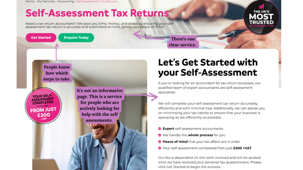
Each Service Page Should Take Readers Through A Journey
Every single service page you create should create a journey for your prospective users. Imagine walking into a store looking for DIY products. The name suggests DIY, but you notice homeware items when you walk in and can’t see any home improvement products.
Would you look around and waste time? Or, would you go to the next DIY shop on your list?
People will treat your website the same. That’s why every single service page has to take them from a journey through discovery, to solution, to understanding, to confidence that your service is the right option for them.
There are a few ways to do this, but I tend to focus on three key formulas. Now I’ll show you these formulas, then give you a look at them in action, as I transform three service pages using each formula.
The Service Page Copy Customer Journey Formulas
| Formula | How it Works | Best For |
| AIDA (Attention, Interest, Desire, Action) | The OG formula and one of the simplest to implement. You grab the visitor’s attention, spark their interest, make them want to access your service, show them how to take action. | Wellbeing Brands & Product-Based Services. |
| PPPP (Promise, Picture, Proof, Push) | Promise to solve a problem, show visitors their future, prove your results, inspire them to take action. | Coaches & Transformation Experts. |
| PASTOR (Pain, agitate, solution, offer, response) | Highlight your visitor’s biggest problem, emphasise the impact it has on their lives, show that you have a solution, position your offer, push the CTA. | Therapists & Mental Health Professionals. |
The Steps for Creating Service Page Copywriting that Gets Conversions
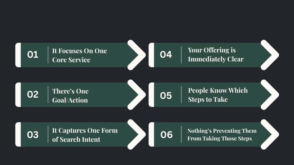
A strong service page usually needs to do four things well.
1: Make the service easy to understand
The reader shouldn’t have to decode the page.
They shouldn’t have to translate vague language or work out what sits behind a clever heading.
They should be able to tell, quickly, what the service is.
→ If it’s website copywriting, say website copywriting.
→ If it’s couples therapy, say couples therapy.
→ If it’s brand design, say brand design.
This sounds simple, but it’s where a lot of pages start going wrong.
They try to sound elevated, strategic, bespoke, tailored, transformative.
But they never get to the point.
And when the service itself isn’t clear, the rest of the message has nothing solid to stand on.
2: Make the problem feel real
This is the part weak service pages often skip.
They name the service, list what’s included, maybe add a few nice-looking sentences about the process, and leave it there.
But people don’t buy services because they want a bullet-point list of deliverables.
They buy because
→ Something isn’t working.
→ Everything feels harder than it should.
→ The experience feels messy, frustrating, unclear, stressful, inconsistent, or stuck.
Your service page needs to show that you understand that.
Not in a dramatic or overblown way.
Just clearly enough that the reader can think:
YES…
that’s the issue
that’s the bit that’s been bothering me
this actually feels relevant
That shift matters.
Because when the problem isn’t named properly, the service can sound technically fine and still feel emotionally flat.
3: Show what changes
Once the problem is clear, the page needs to show what the service helps move someone towards.
This is where a lot of pages stay too close to features.
They talk about calls, deliverables, timelines, strategy decks, templates, sessions, rounds of edits.
Some of that matters.
But on its own, it doesn’t create much pull.
The reader also needs to understand the shift.
What becomes easier?
When are things clearer?
Is the experience less stressful?
What becomes more manageable, more focused, more confident, more effective?
That’s what helps the service feel valuable.
Not because outcomes should replace the practical details.
Because the practical details make more sense when the outcome is clear first.
4: Reduce doubt
Every service page is asking the reader to believe something.
That you understand the issue. That your service makes sense. That your process is thoughtful.
That taking the next step won’t feel like a waste of time.
That’s why proof matters.
Without it, a page can sound nice but still feel thin.
Proof doesn’t always have to mean a huge case study or dramatic transformation.
It can be:
- A testimonial
- A client result
- A before-and-after shift
- Relevant experience
- A clear explanation of how you work
- An example of the kind of problem you help with
- An objection handled properly
The point is this:
If the page is making a claim, it should give the reader something to hold onto.
Why some service pages sound fine but still don’t work
This is where it gets interesting. Because most weak service pages aren’t obviously bad.
They’re not full of typos. The design isn’t a disaster. The copy sounds perfectly reasonable. And yet — something isn’t landing.
Here’s why that happens.

- They sound polished, but not specific: The language is tidy, but the message is slippery. The reader gets to the bottom of the page and still couldn’t tell you what makes this service different, who it’s actually for, or why it matters. Polished isn’t the same as clear.
- They describe the service without making it feel relevant: The page explains what the business does. It just doesn’t help the reader connect that to their own situation. So the message stays at arm’s length — informative, but not persuasive.
- They lead with deliverables instead of outcomes: Here’s what’s included. Here’s how many sessions you get. Here’s the process. But not: here’s what changes for you. Features without context don’t give people a reason to care.
- They try to speak to everyone: The broader the audience, the weaker the message. When a page is written for anyone, the right person can’t find themselves in it.
- They lean on words that don’t mean anything anymore: Tailored. Bespoke. Strategic. Supportive. Expert. None of these are wrong — they’re just not doing any real work. If these words are carrying the whole page, the page probably isn’t saying enough.
- They make the next step feel like an afterthought: Even great copy loses momentum if the CTA is vague, buried, or unconvincing. If someone has to hunt for what to do next, most of them won’t bother.
Take A Look At Your Service Pages…Notice Any of These?
They sound polished, but not specific
Too vague: “Strategic support tailored to your unique business journey” It sounds polished…but says absolutely nothing. The right client lands on this page and still doesn’t know what they’re actually getting, who it’s for, or what changes for them after working with you.
Better: “Six months of one-to-one business coaching for service providers who are ready to go from inconsistent income to fully booked.”
They describe the service without making it feel relevant
Too broad: One page trying to cover five different services. It’s harder to rank and harder to convert — because the person looking for social media management and the person looking for a brand strategy aren’t the same person, and they don’t want to feel like they are.
Better: One page, one service, one reader in mind.
They lead with deliverables instead of outcomes
Too feature-heavy: A long list of what’s included without enough about the problem, the shift, or why it matters. “Six sessions, a workbook, and a private Slack channel” tells someone what they’re getting. It doesn’t tell them what’s different on the other side.
Better: Lead with the outcome, then back it up with what’s included. “By the end of this programme, you’ll have a content strategy you can actually stick to — and the sessions, workbook, and support to make sure you do.”
They try to speak to everyone
Too little focus: No clear primary keyword, no clear page goal, no clear CTA. When a page is written for anyone, it converts no one. The right person can’t find themselves in it, and search engines can’t work out what it’s actually about.
Better: Get specific about who this is for and say it early. The people it’s not for will leave — and that’s fine.
They rely on generic reassurance
Too much fluff: A page that sounds “professional” but doesn’t really help the reader decide anything. Words like tailored, supportive, bespoke, and expert have been used so many times they’ve stopped meaning anything. If they’re doing all the heavy lifting, the page isn’t saying enough.
Better: Swap the adjectives for evidence. Instead of “expert support,” try “I’ve helped 40 small business owners get to the first page of Google without running a single ad.”
They make the next step feel like an afterthought
A weak CTA: “Get in touch” at the bottom of the page, easy to miss and easy to ignore. Even a strong service page loses momentum if the next step feels vague or buried.
Better: Tell them exactly what happens when they click. “Book a free 20-minute call — I’ll take a look at your current setup and tell you exactly where to focus first.”
Ready to Write Better Service Pages?
Service page copywriting is about clarity and making it easy for your readers to take action. Instead of focusing on being creative, make sure your pages align with your audience’s pain point, and position you as the authority.
I highly recommend focusing on your homepage copywriting first, as this sets the tone for the rest of your website pages.
And, if you’d like to see what service page copywriting rewrites look like in practice, take a look at these teardowns.
Prefer handing copywriting over to someone else? My website copywriting services can help you connect with more clients and turn them into long-term working relationships.